
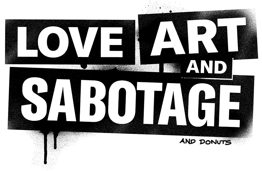
The occupation as art director and graphic designer establishes a preference for typography and striking illustrations, mostly painted on large-format wooden panels – a kind of creative upcycling. More or less clearly, individual motifs and words borrow from the media background noise:
song lyrics, slogans, advertising messages and motivational sayings. In contrast to the other elements, words and symbols develop a subtlety, multi-layered like the backgrounds painted over several times. This is sometimes reminiscent of PopArt and graffiti, but is clearly driven by the social question. The work in precarious conditions, the social Darwinism of the street, life in an increasingly foreign-determined urban space, the various degrees of uncontroversial impoverishment, and again and again: the sold rebellion – this and much more (like the hell of adolescence) finds a mocking, dark-colorful echo in the picture cycles.
Since 2008 participation in various exhibitions in a predominantly subcultural setting, preferably in appropriate rooms between the urinal and the occupied house.